Canonical
on 9 August 2016
Back in June we hosted a competition that asked developers to use the AdaptivePageLayout component from the UI toolkit to create an app that converges across devices. We had some very impressive entires that used the component in different ways; choosing a winner was hard. However, after testing all the apps the design team chose a winner: the Timer App.
How does the AdaptivepageLayout work?
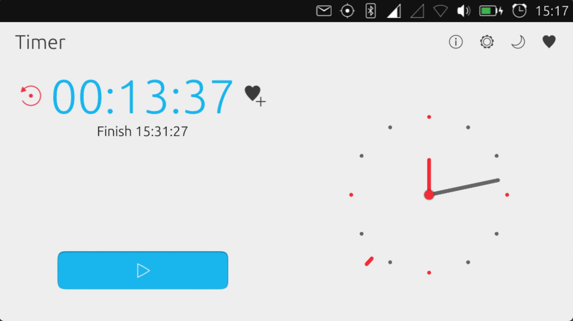
The AdaptivePageLayout component eliminates guesswork for developers when adapting from one form factor to another. It works by tracking an infinite number of virtual columns that may be displayed on a screen at once. For example, an app will automatically switch between a 1-panel and 2-panel layout when the user changes the size of the window or surface, by dragging the app from the main stage to the side stage.
You can read more about convergence and how the adaptive page layout works in the App design guides.
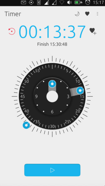
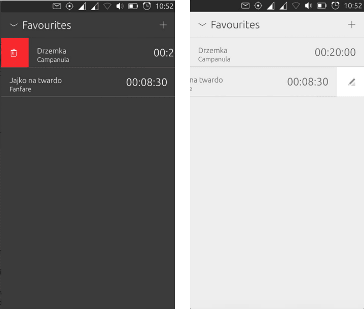
Timer app
The Timer app impressed the design team the most with its slick transitions, well thought-out design and ease of use. It used the AdaptivepageLayout well when it translated to different screens.
Design feedback
- Design: well-considered touches with design, animation and various cool themes.
- Usability: a favourite is the ability to drag seconds / minutes / hours directly on the clock.
- Convergence: adjusts beautifully to different screen sizes.
Other entries
Thank you to all who participated in making their apps look even more slick. Here are the other entries:
2nd: AIDA64 App
- Design: clean, readable with clear content
- Usability: pretty flawless
- Convergence: Adaptive Page Layout suits this type of application well and is used well
3rd: Movie Time
- Design: functional with good management of all the content
- Usability: live results for search works smoothly as well as trailer links
- Convergence: the gridview of poster art lends itself well to various screen sizes
4th: Ubuntu Hangups
- Design: clean and follows guidelines well
- Usability: easy to message / chat, with user-friendly functionality
- Convergence: easy to use particularly on Phone and Tablet
5th: uBeginner
- Design: basic and clean
- Usability: information is well-presented
- Convergence: uses the Adaptive Page Layout well
Try it yourself!
To get involved in building apps, click here.